CHALLENGE:
Develop the brand redesign for Lavvoro, a 100% Santandereano venture, which seeks to be the first App in Colombia that provides job opportunities to freelancers in a very wide variety of areas, so that the consumer can get any professional or expert advice , without there being excluded performance areas. A brand that should convey confidence, work and above all dynamism.
STRATEGY:
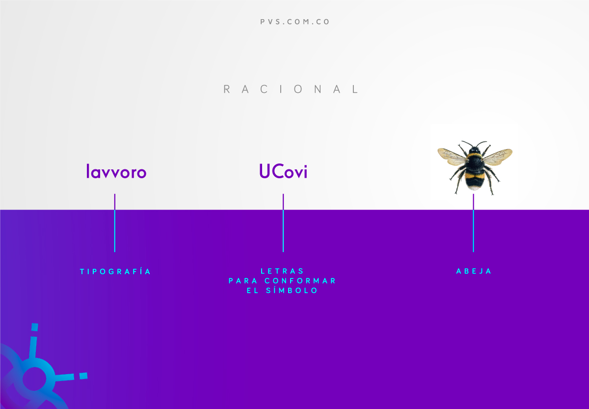
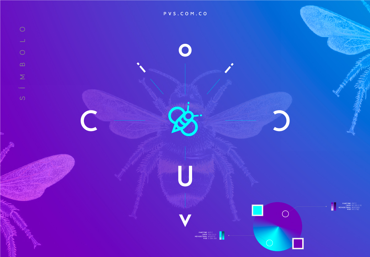
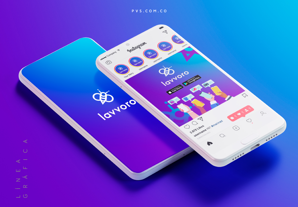
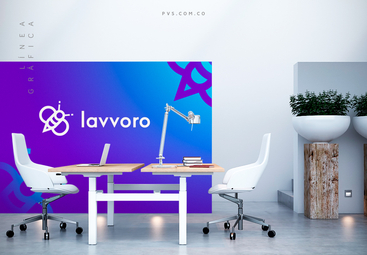
We built the symbol with the letters U, V, I, C, O, from the WindleshamPro typeface family, we freed the bee from the square container and proposed a more digital and technological color palette.
RESULTS:
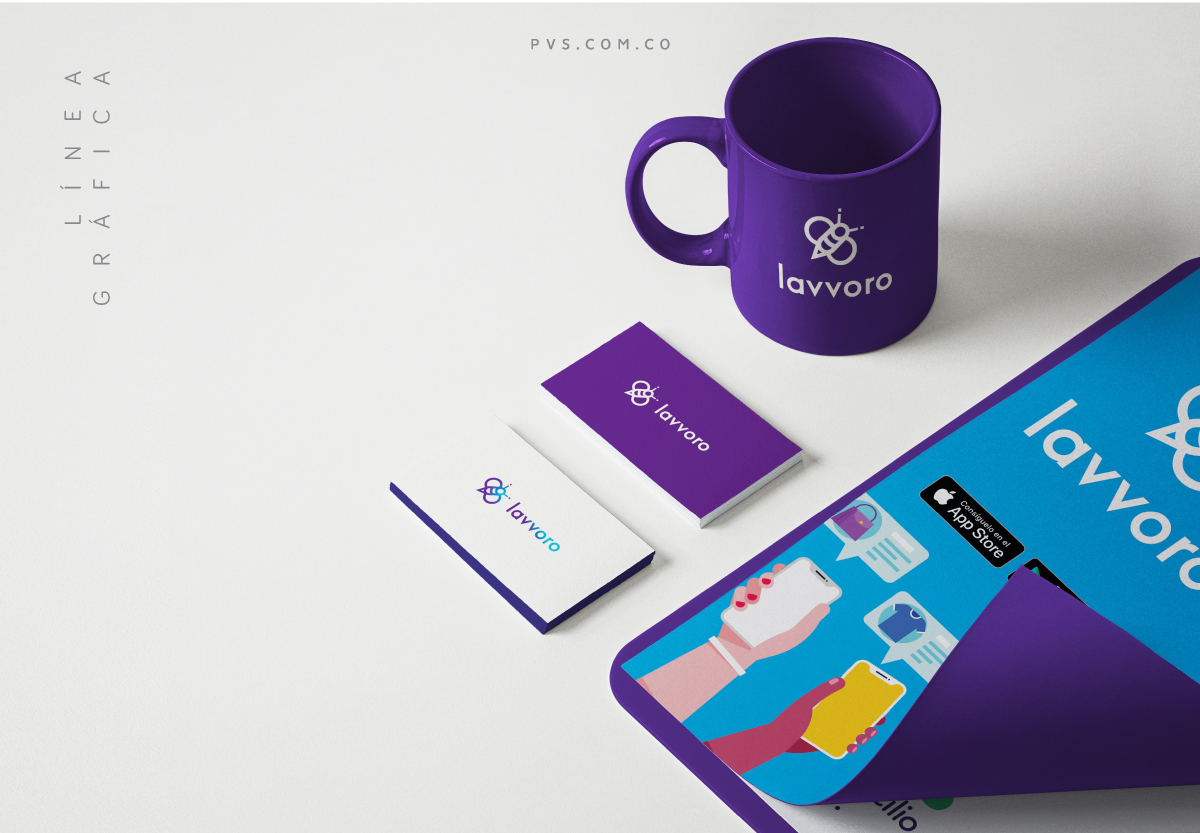
Now it is a dynamic, reliable, versatile identity that inspires and that bets on the job opportunities of our country.
Details
- Category: Branding
-
Client:
Nicolás Guerrero / CEO / Lavvoro
- Product: Branding
- Reference: Presentation, look and feel
- Category: Lavvoro
- Published: February 26, 2020


