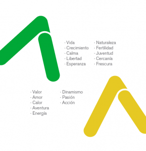
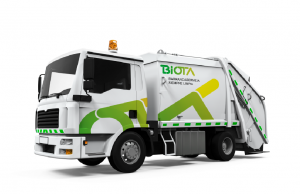
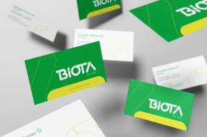
The intention of generating a curved typeface is to connote the mobility that we are going to have throughout the metropolitan area of Barrancabermeja; likewise, the stripes represent the connection between people and Biota as a friendly brand.
Details
- Category: Branding
- Client: Biota
- Product: Institutional
- Reference: Visual identity
- Category: Visual identity
- Published: Noviember 6, 2014


